Once you make your selection from the two drop-downs, hit the "OK" or "Update"
button to see the charts.
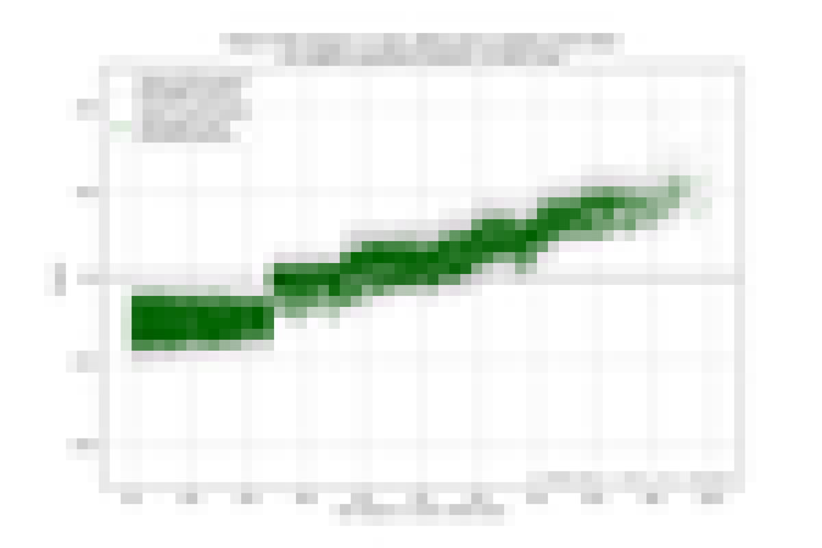
The first chart shows the impact of the feature you chose on median
home prices, correcting for all other features. So, if you selected
Fraction Hispanic or Latino, then the chart shows the impact of the
fraction of the population that is Hispanic or Latino on median home
prices independent of all other features.
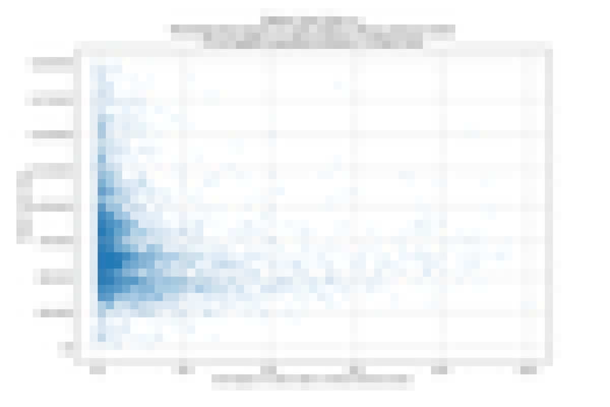
The second chart is a scatter plot of the actual median home value vs. the selected
feature. There is less obvious information here because the effects
of other features, which may or may not be correlated with the feature
of interest, are not removed.
The difference between the two charts shows us the additional value of
the impact chart approach used in the first
chart.
Please select the area you are interested in:
Please select the feature whose impact you want to plot:
Impact
The impact chart below shows the impact of a single feature in the
data the ensemble of 50 models was trained on the prediction is made for each block
group. The green dots are ensemble predictions for each block group. Each green dot's
x coordinate is the value of the feature for the block group. Its y
coordinate is the impact on the ensemble's predicted median home value for that block
group.
For each block group there are also 50 gray dots vertically above or below the green
dot. These are the predictions of the 50 models that make up the ensemble, and give
an idea of the variance of the ensemble prediciton.
Input Distribution
The chart below shows the relationship between a single feature in the
data the model was trained and the median home value it was trained to
predict. The impact in the chart above is what the model decided the impact
of this feature was, taking into account the impact of all other features
also. Each dot represents a single block group.